Nashville Airbnb
A thoughtfully designed Nashville apartment created to balance comfort, character, and performance - for short-term rental use while feeling calm, warm, and highly livable.
Location
Nashville, TN
Property type
Short-term rental apartment
Scope
Full interior design & styling
Key result
Increased booking appeal and stronger guest experience
Project overview
From ordinary apartment to standout Nashville stay
This apartment was redesigned with one clear goal: to create a space that feels inviting, memorable, and effortless for guests, while remaining durable and practical for ongoing rental use. Before the redesign, the space lacked visual identity and cohesion. The layout felt generic, and the interiors did not reflect the warmth or character expected from a Nashville stay. Our task was to elevate the atmosphere, improve flow, and introduce a design language that would stand out in listing photos and guest reviews. The solution focused on clean lines, warm materials, and a restrained palette — creating a space that feels relaxed, intentional, and easy to enjoy from the moment guests arrive.
Project gallery
A visual tour of the redesigned space
Scroll through the images below to see how each area was reworked - from the main living space to the sleeping area and details throughout the apartment.
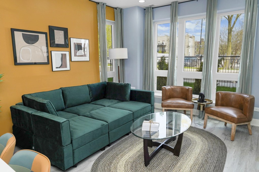
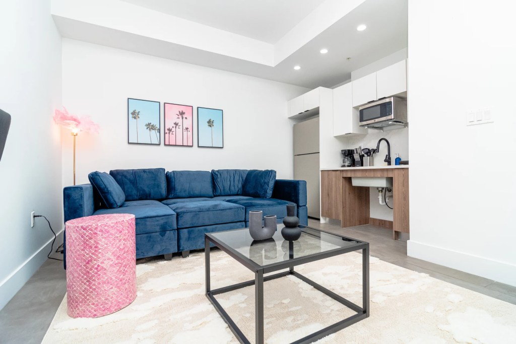
Living area – hero view
A welcoming living space designed with balanced proportions, warm textures, and a clear conversation layout.

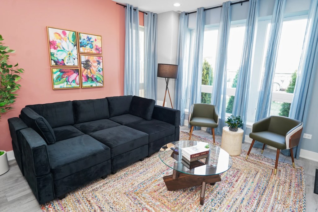
Living area – alternate angle
An open, comfortable seating arrangement that supports both relaxation and social use.
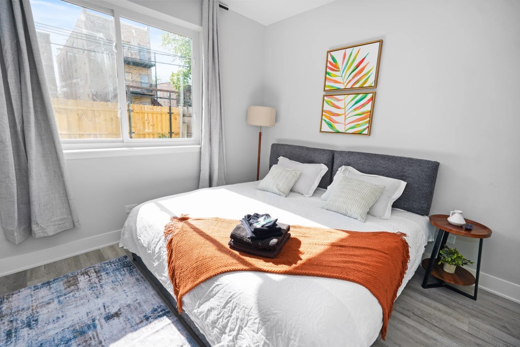
Sleeping corner
A calm, hotel-inspired sleeping area with layered lighting and soft materials to promote rest.

Bedroom styling details
Subtle lighting and warm tones create a cozy, inviting feel for nighttime use.
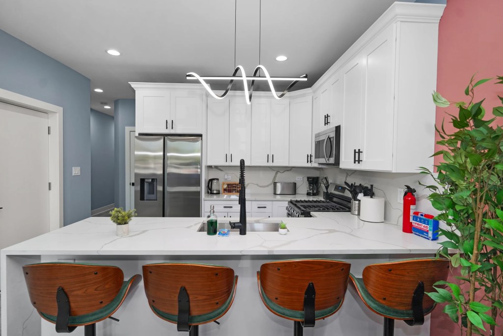
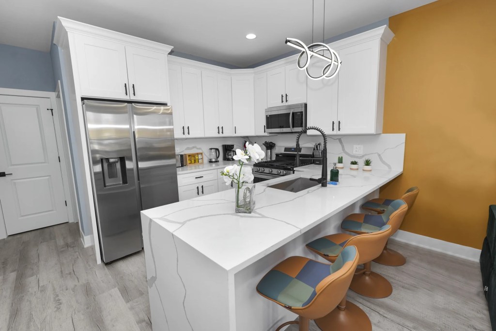
Kitchen update
A clean, practical kitchen with durable finishes and intuitive layout, created to support short stays and everyday comfort.
Space by space
What changed in each area
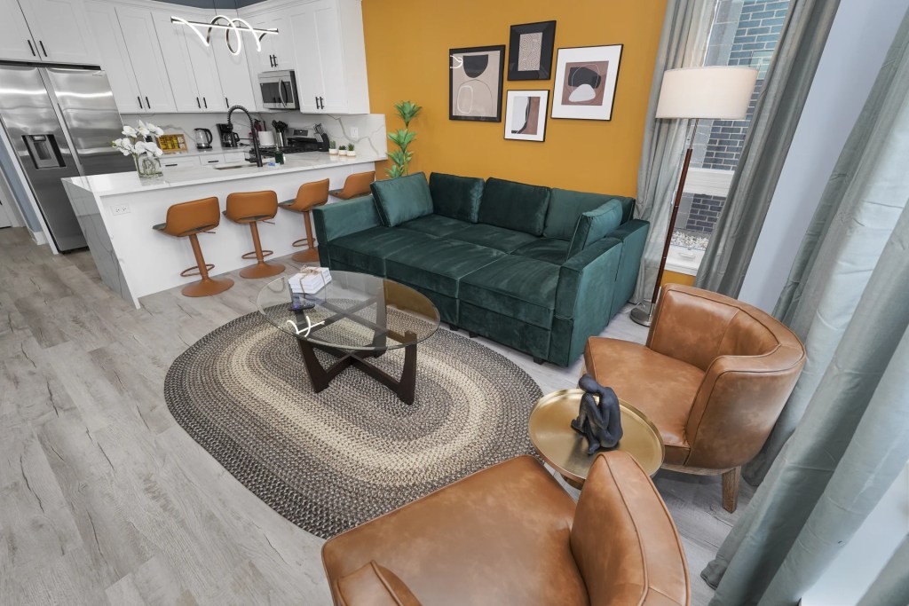
Living area
The living area is designed as the heart of the space — bright, inviting, and visually balanced. A clear layout anchors the room, allowing guests to relax, gather, or unwind without visual noise. Thoughtful furniture placement creates openness while still feeling cozy and intentional.
Challenge
The original layout felt busy and lacked a clear focal point, making the space feel visually heavy and less inviting.
Solution
We simplified the layout and introduced lighter furniture, warm wood accents, and a cohesive color palette. The result is a comfortable, well-proportioned living space that feels welcoming both in person and on camera.
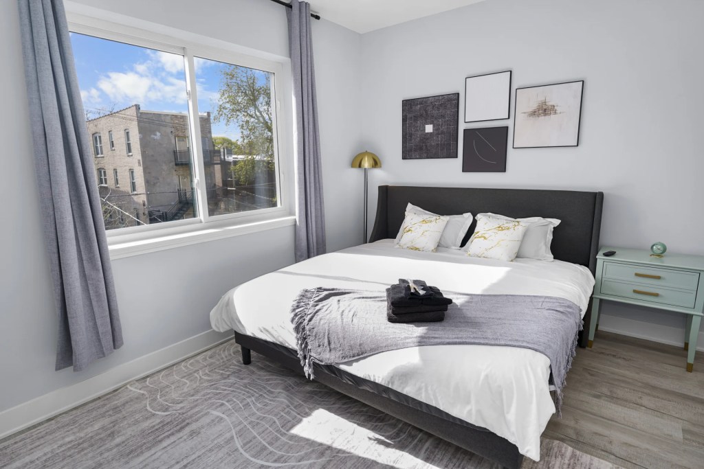
Sleeping corner
The sleeping corner is now a defined, calming retreat within the open layout. Soft textiles, warm lighting, and intentional placement create a sense of separation while maintaining the loft’s openness.
Challenge
The bed was previously exposed in the center of the space, offering little privacy and making the entire loft feel like one large bedroom.
Solution
We repositioned the bed and layered the area with softer materials and lighting to create a distinct sleeping zone with improved comfort, privacy, and a hotel-like feel.
Kitchen & dining
The kitchen and dining area feels refreshed, functional, and contemporary. Clean finishes and updated details bring new life to the space, while the dining setup comfortably supports both everyday use and entertaining.
Challenge
Outdated finishes and lighting made the kitchen feel visually dated and limited the dining experience.
Solution
We updated the fronts, hardware, and lighting, and introduced a versatile dining table. The space now feels modern, warm, and practical without sacrificing flow.
Entrance
The entryway is designed for real-life use, offering guests an organized and welcoming first impression. Storage is integrated seamlessly so the rest of the space stays visually calm.
Challenge
Lack of designated storage caused bags, coats, and shoes to spread throughout the unit, creating clutter.
Solution
We added hooks, a bench, and closed storage directly at the entrance, giving guests an intuitive drop zone and keeping the rest of the loft clean and uncluttered.
Challenges & goals
What wasn’t working before the redesign
Guest feedback pointed to discomfort, unclear storage solutions, and awkward circulation throughout the space
Furniture and décor felt generic and failed to stand out among competing short-term rental listings
Insufficient and uneven lighting created dark corners, making the loft feel smaller both in person and in listing photos
The open layout lacked clear zoning, blurring the boundaries between sleeping, lounging, and working areas
The goal was to preserve the character of the loft while transforming it into a space that feels intuitive, comfortable, and visually compelling
Design approach
How the space was reimagined
Layout & zoning
The open loft was restructured into clearly defined zones that guide guests intuitively through the space. Sleeping, lounging, dining, and working areas were intentionally separated through furniture placement and scale — improving flow while maintaining openness. The living area now anchors the layout visually, creating a strong first impression in both real life and listing photos.
Materials & colour
A warm, modern palette was introduced to balance comfort with visual clarity. Neutral base tones are layered with wood textures, soft upholstery, and curated accents to add depth without visual overload. Every material was selected for durability and ease of maintenance, ensuring the space performs well under frequent guest turnover.
Lighting
Lighting was treated as a design feature, not an afterthought. Dimmable fixtures allow the atmosphere to shift seamlessly from bright and functional during the day to soft and inviting in the evening, enhancing both guest experience and photography.
Styling & photography prep
Styling focused on creating character without clutter. Each vignette was composed with photography in mind, ensuring clean sightlines and strong visual moments from every angle. The result is a space that feels lived-in and welcoming, yet instantly recognizable and competitive in online listings.
Results
The impact of the redesign
Once the redesign was complete, the loft shifted from blending in to standing out. The improved layout, lighting, and visual clarity translated directly into stronger performance
+37% booking activity
following the launch of the redesigned space
+18% average nightly rate
driven by a more premium look
Stronger guest feedback
highlighting comfort, atmosphere, and overall experience
Fewer guest questions & issues
Thanks to clearer zoning and better in-unit clarity
Design details
Key choices behind the look and feel
1
Colour palette
Warm, balanced neutrals form the foundation of the space, creating a calm backdrop that feels inviting in person and consistent in photography
2
Materials
Durable finishes, easy-to-maintain fabrics, and solid hardware ensure the space holds up beautifully under frequent guest stays without sacrificing style or comfort
3
Furniture
Clean-lined, compact pieces support the open layout while maximizing comfort and circulation. Select items incorporate discreet storage to keep the space functional and visually uncluttered.
4
Accessories
Accessories were kept intentional and minimal. Each piece adds character and warmth while reinforcing key visual moments that photograph well
Chicago Airbnb
Each unit is approached with a clear goal: to create spaces that feel welcoming, photograph
Miami Airbnb
A ground-up interior design for a Miami short-term rental hotel, created to feel effortless, inviting,
Santa Rosa Airbnb
A dated Santa Rosa Beach apartment reimagined as a fresh, modern short-term rental. The redesign